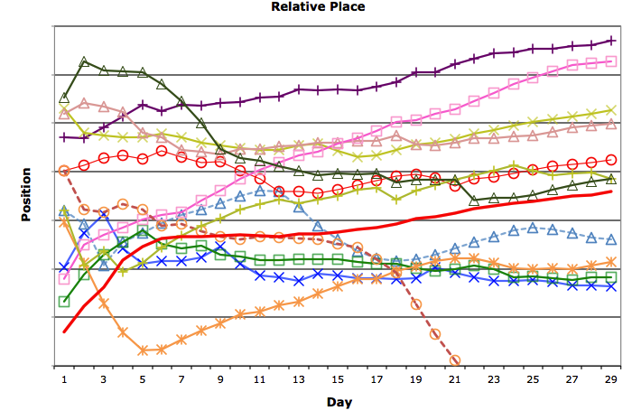
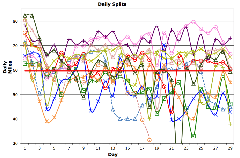
 Medur, our indispensable ‘computer guy’, has generated two somewhat confusing looking charts. Actually, as you look closer at the charts, it becomes clear as to what is going on. As it states below the first chart: “The above chart displays the relative position of the runners as a percentage of the total combined cumulative distance run each day. The cutoff is the distance required to finish the race within the official race duration of 52 days.” And the second chart: “This chart plots the actual daily mileage of each runner. The cutoff is the daily distance of 59.6 miles required to complete the race in 52 days.” Also included is the color associated with each runner. So, I hope this is clear to you. I am still looking for the green line in chart one. To get a clearer picture of the charts please link to http://3100.srichinmoyraces.org/3100-results-2012.

